Written by
Juan Carlos Munoz & Carla Capriles
Last Updated
January 13, 2026


Color psychology is a powerful tool in branding, UI/UX design, and digital marketing. Choosing the right colors for your SaaS product, Webflow website, or startup brand can increase trust, improve engagement, and boost conversions. Let’s explore the most popular colors in the world and how they influence branding and UI design.
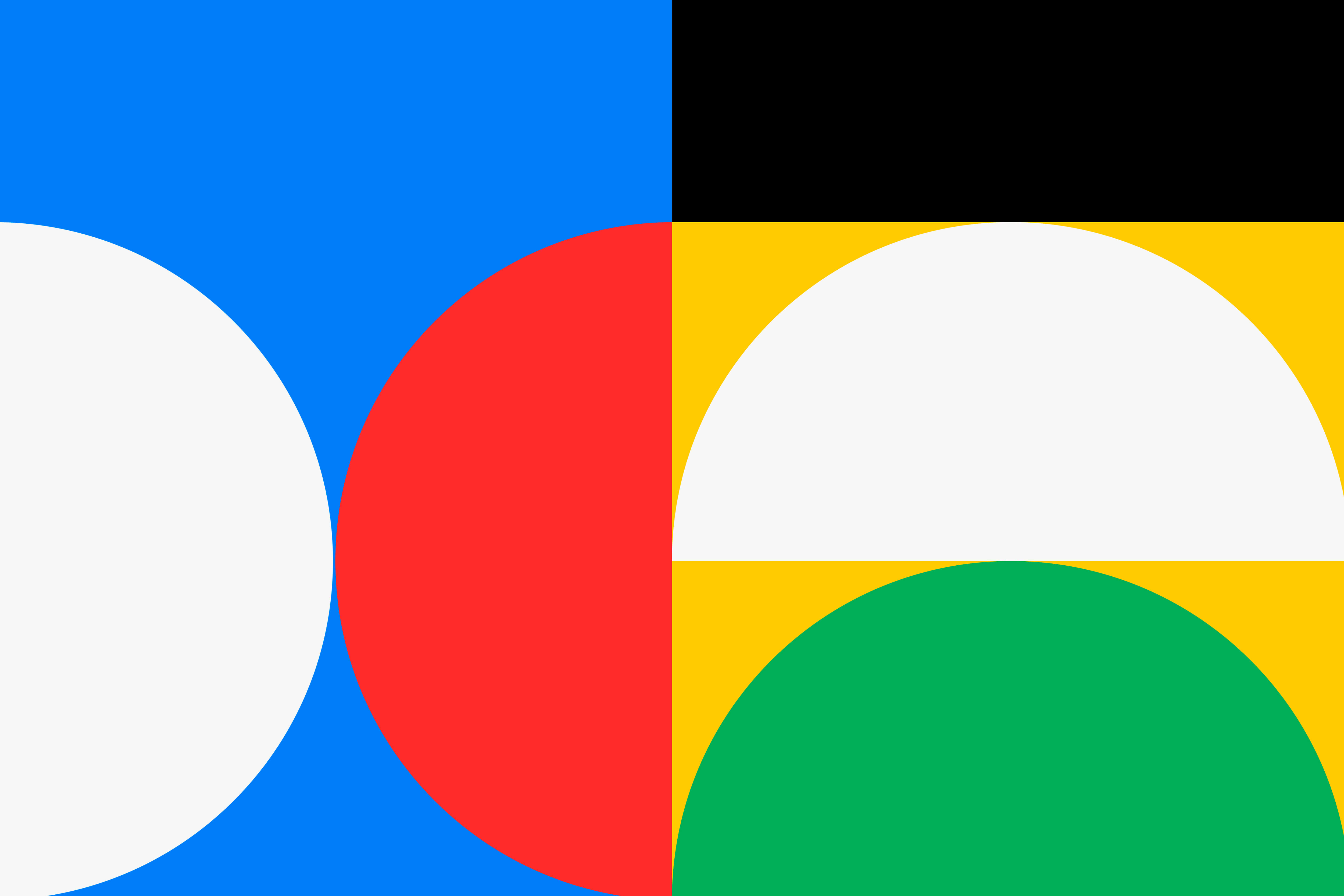
The most popular colors—blue (trust and reliability), red (urgency and excitement), green (growth and sustainability), yellow (optimism and attention), black (luxury and sophistication), white (simplicity and minimalism), purple (creativity and exclusivity), orange (energy and engagement), pink (playfulness and boldness), and gray (neutrality and professionalism), each play a role in branding and UI/UX design. These colors influence user perception, emotions, and decision-making in digital products and marketing.
Colors shape how users interact with brands, products, and digital experiences. Whether you're designing a SaaS platform, a Webflow website, or refining a startup brand, strategic color choices can make a significant impact. Let’s dive into the psychology behind the most influential colors in branding and UI/UX design.

Blue is the most trusted and universally liked color. It conveys trust, reliability, and professionalism, making it the go-to for SaaS companies, fintech brands, and corporate services. Brands like Facebook, LinkedIn, and Stripe use blue to build credibility and enhance usability. It also supports focused, low-friction UI/UX design.
Red is high-energy and attention-grabbing. It creates a sense of urgency, excitement, and power, making it ideal for CTA buttons, sales promotions, and entertainment platforms. Brands like YouTube, Netflix, and HubSpot use red to encourage fast action and higher engagement.
Green signals growth, stability, and wellness. It’s widely used in healthtech, fintech, and sustainability-focused brands like Slack, Asana, and Whole Foods. In UI/UX, green works well in confirmation messages, financial dashboards, and progress indicators.
Yellow is bright, visible, and optimistic. It brings attention to playful features and works well in onboarding flows or notification systems. Brands like Snapchat, Bumble, and IKEA use yellow to express warmth, creativity, and personality.
Black gives off a sense of elegance and exclusivity. Luxury, fashion, and high-end tech brands like Apple, Tesla, and Chanel rely on black to elevate their visual identity and deliver a minimalist, premium feel.
White represents clarity and simplicity. It plays a critical role in modern interfaces, helping create visual space, reduce cognitive load, and improve readability. Brands like Google and Airbnb rely heavily on white to keep digital experiences clean and approachable.
Purple stands for creativity, innovation, and uniqueness. It’s a favorite among tech startups, creators, and premium services. Twitch, Adobe, and Cadbury use purple to stand out, express originality, and connect with imaginative audiences.
Orange is energetic and friendly. It encourages action and engagement, especially in product-led growth strategies. Brands like Duolingo, Fanta, and Harley-Davidson use orange to create a bold and welcoming identity.
Pink blends boldness with playfulness. It’s used by modern brands that want to feel vibrant and personable, like T-Mobile, Canva, and Barbie. In UI/UX, pink works well for adding warmth and individuality.
Gray is neutral, balanced, and timeless. It’s often used as a foundation color in digital design and communicates stability and professionalism. Tech-forward companies like Apple and Salesforce apply gray to build a modern, functional look without distraction.

Your color palette should reflect your brand’s personality and align with how you want users to feel. If your brand is energetic and bold, brighter colors may suit you. If you’re focused on professionalism or trust, subdued tones like blue, gray, or green may work better. Most brands stick to one dominant color supported by a few accents and a neutral tone. Always test your palette in different UI contexts to ensure consistency across light and dark modes. Tools like Figma, Adobe Color, and Coolors can help you visualize and fine-tune your choices.
Colors must serve everyone, not just look good. When building your UI, aim for strong contrast between text and background so all users can comfortably navigate your site. Avoid using color alone to signal important actions like form errors or success states. Test your design with contrast tools to ensure it meets accessibility standards. Inclusive design improves UX and expands your reach.
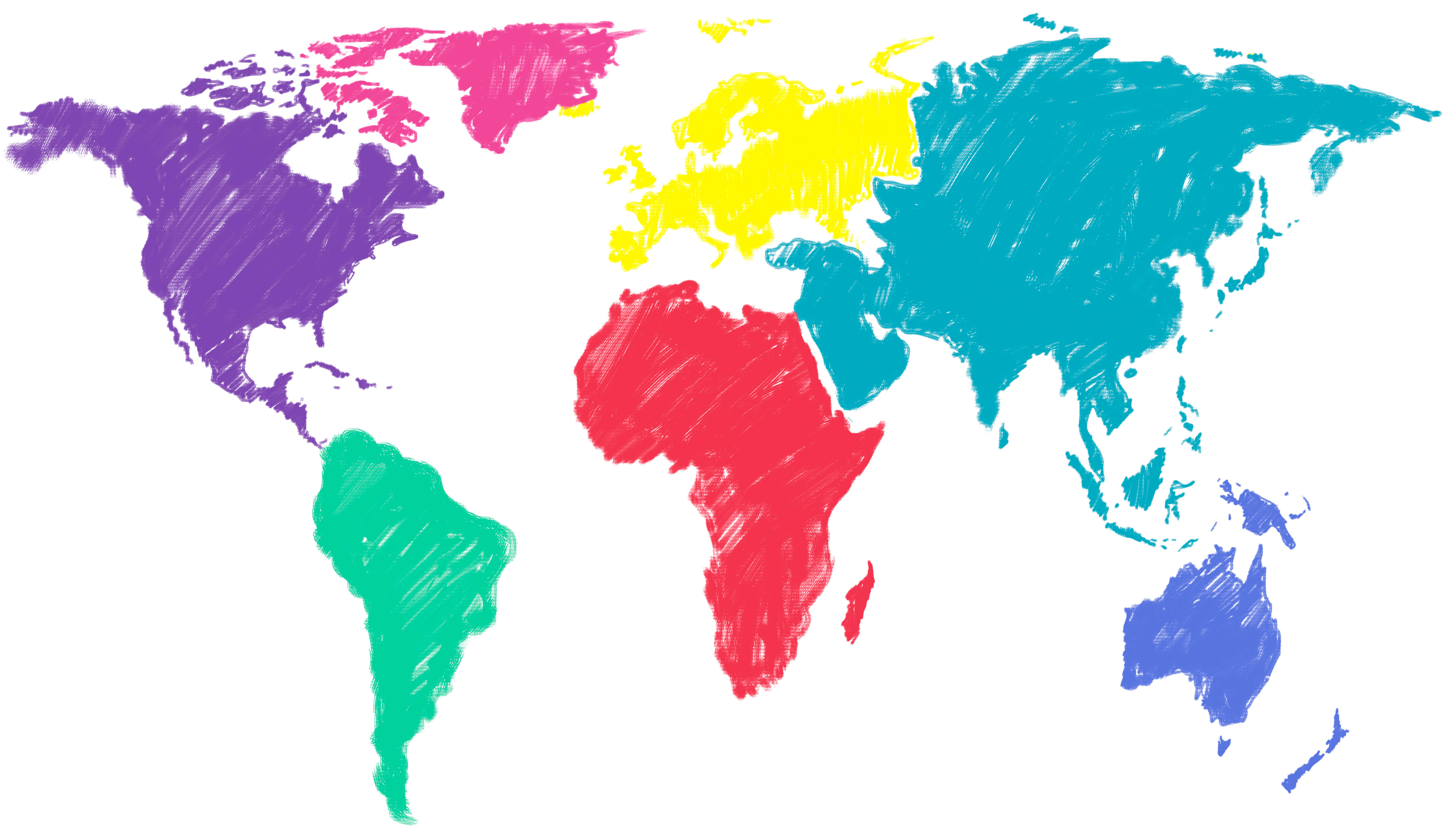
Colors don’t mean the same thing everywhere. Red might represent urgency in Western interfaces but is a symbol of luck in China. White may suggest simplicity and clarity in some cultures but is tied to mourning in others. If your product serves a global audience, take the time to evaluate how your color choices could be interpreted differently depending on the region.
Choosing the right colors isn’t just about aesthetics, it directly impacts user engagement, conversions, and brand perception. Whether you're designing a SaaS product, creating your brand or refining UI design, leveraging color psychology is essential for success.
Looking to build a brand that connects and converts?
At CC Creative Design, we help SaaS startups define their color strategy, design intuitive UI/UX, and launch high-performing products. Start your project with us.
.jpeg)
For start-up founders or growing business owners, apps offer a vast amount of opportunity....
View More.jpg)
A well-designed startup landing page is essential ...
View More.jpg)
Social media can be a great place to connect with friends, keep up with the news and trends ...
View More


